 Teacher's Community
  Support
ViewSonic ColorPro Standardizes Design Color Across Offices and Stores
- Sep 15, 2026
SOLUTION BRIEF
ViewSonic ColorPro Standardizes Design Color Across Offices and Stores
CHALLENGE
A global retail brand runs an annual technology refresh across its corporate offices and physical stores. For this cycle the priority was visualization: giving design and product teams a display they could trust when they judge colors and materials.
Small differences in how a screen renders a color can change a decision. When teams at different sites worked on different displays, a material approved at one location did not always look the same at another. The brand needed one color reference everywhere, so a sign-off in one office holds up in the next.
SOLUTION
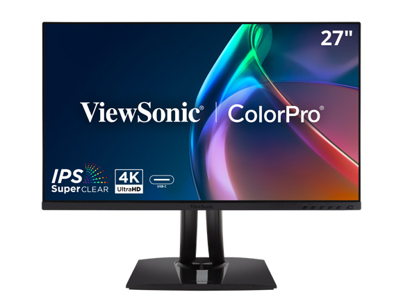
The brand deployed hundreds of ViewSonic® ColorPro® VP2756-4K monitors across its corporate offices and stores.
The ViewSonic monitors sit where color decisions get made. Design and product teams use them to review designs, colors and materials before approval, and cross-functional groups use them when everyone needs to agree on what they are looking at.
That type of work requires more from a display than a standard office monitor can deliver. Office monitors are not calibrated for color accuracy, so a design approved on one screen can look different on the next.
The VP2756-4K is built for the job. Every unit is individually factory calibrated and Pantone Validated, covers 100% of sRGB and Rec. 709, and holds Delta E value under 2. At 4K resolution on a 27-inch IPS panel, reviewers also see detail that earlier displays flattened.
“The color accuracy and level of detail offered by the VP2756-4K allow us to work with greater confidence when reviewing designs and materials, facilitating decision-making and collaboration across our teams.”
RESULTS
Design and product review teams now work from one shared color reference across every site in the project. Working from the same reference removed a recurring source of friction, where two reviewers looking at the same file described two different colors, and product approval cycles move faster because nobody is relitigating what the screen is showing.
The deployment did more than replace hardware. A color-critical display is now part of how design and product decisions get made. The result is more consistency, better accuracy and faster turnaround.
Related Products
Actual performance, compatibility, and user experience may vary depending on system configuration, network conditions, usage environment, and other factors. Programs, pricing, specifications, and availability are subject to change without notice. This document contains forward-looking statements that reflect the company’s expectations regarding upcoming events and product offers; actual events and product offers may differ significantly from those anticipated. Corporate names and trademarks mentioned herein are the property of their respective companies. © 2026, ViewSonic Corporation. All rights reserved. 8/26 [26MON-LAT1551]


Login and Registration Form