4 Photography Tips for Editing Using Adobe Lightroom
How to achieve dramatic and atmospheric style in photos
I wanted to share a few photography tips, but this time related to editing, using Adobe Lightroom. This is the keystone to achieving my dramatic and atmospheric style in my photos.
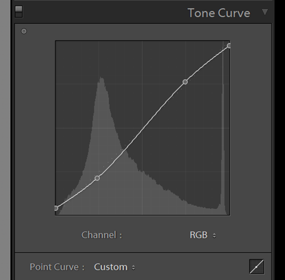
Tip 1 – Tone curve fade
This is a standard tone curve in a typical S shape, you may be familiar with the S curve and I use a variant on this for most of my edits. This dampens the blacks and whites, creating a more matte look.
You can adjust the strength of curve to suit your style, by bringing up the darks on the left side (creates a more matte look in the blacks) or bringing down the top right of the curve to fade the whites to a more flat look. The overall effect is creating a more subtle tonal balance.
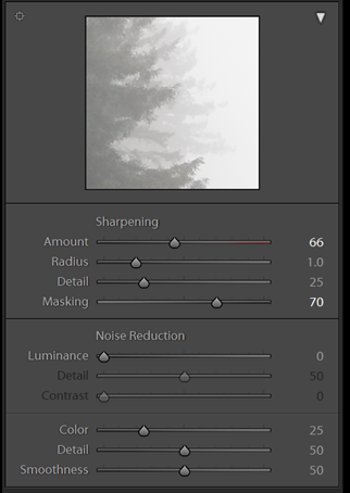
Tip 2 – Detail & sharpening
In order to retain the crispness of an image, despite the reduced clarity from the basic panel adjustment, I tend to add an increased amount of sharpness, which is applied on all my presets also.
The secret to doing this without introducing noise is to hold alt / cmd key and drag the masking slider to see where the sharpening is being applied to. I typically hover around 50-70 which is usually the edges only. Now the image will be looking almost painting like whilst retaining sharpness on the edges!
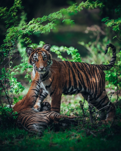
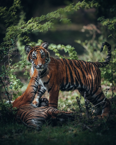
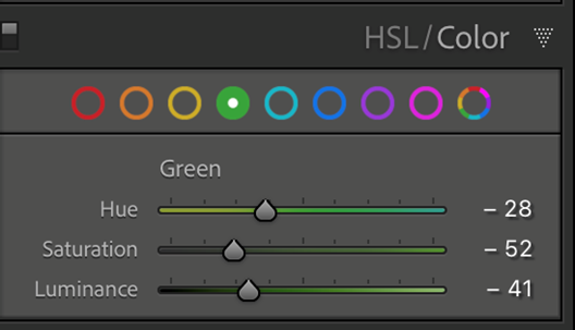
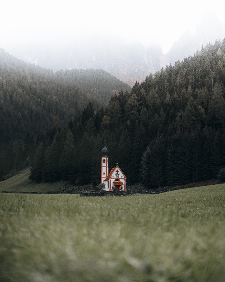
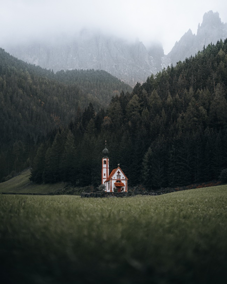
Tip 3 – Colour Grade
I wanted to show the power of colour grading using just 1 colour slider – in this example, the green slider in Lightroom. My adjusting the hue to the left, (more yellow) and reducing the saturation and luminance we can achieve a totally different atmosphere, a more natural colour yet far more visually appealing and cinematic in my opinion. Check the images below of the Tigers to see the difference!
Tip 4 – Adding Dynamic Light
The last thing I do to an image is work with the graduated filter controls to add depth and dynamism to an image through playing with the lighting. Typically I will lighten / darken certain areas of an image to lead the eye in the frame and create a sense of atmosphere. In the image below you will see it looks quite flat before adding a darkening to the foreground and sky and after it really leads you into the centre of the frame to capture all your attention on the important aspects of the photo.
其他人對這些產品也有興趣
-

VP2766-2K-W
Moniteur 27 pouces 120 Hz 2K QHD certifié Pantone 100 % sRGB et calibré en usine avec alimentation USB-C 90 W
了解更多 -

VP2766-2K
Moniteur 27 pouces 120 Hz 2K QHD certifié Pantone 100 % sRGB et calibré en usine avec alimentation USB-C 90 W
了解更多 -
Écran Incurvé 38" - VP3881a
Moniteur pc incurvé 38" Pouces validé 100% sRGB
了解更多


